Why meditate on colors?
Meditation on colors can benefit you. You will like every color that you meditate on. When you buy clothes, household goods, or anything, you won’t be picky on colors. However, that is not to assume that you can mix a wild assortment of colors together. Unless you really desire that look. You’ll accept different colors and experience ease of shopping.
How to meditate on colors
You can use a color chart or color wheel. First, you focus on a particular color. Concentrate and think of what this color brings to your mind. Now close your eyes. Think of the color and be open to the feelings and thoughts that come to you. If you had thought of good attributes of that color, then you’ll come to like that color. Meditation is supposed to open your senses to the good associations of that color. If for some reason you cannot feel opr think of the good forces of that color, then it is better to leave that color and maybe move on to another color.
When you’ve assimilated the knowledge of what a color means to you, you’ll also understand why other people use that color. Your eyes are opened. You’ll understand people and their choice of colors. This knowledge can help you in your work, relationships with people, and ideas on how to interact and work with people, to get co-operation. When you understand why people choose to use their colors, you’ll connect and relate better with them. If you’re doing sales, customer service or people related work, you’ll be able to work with people better.
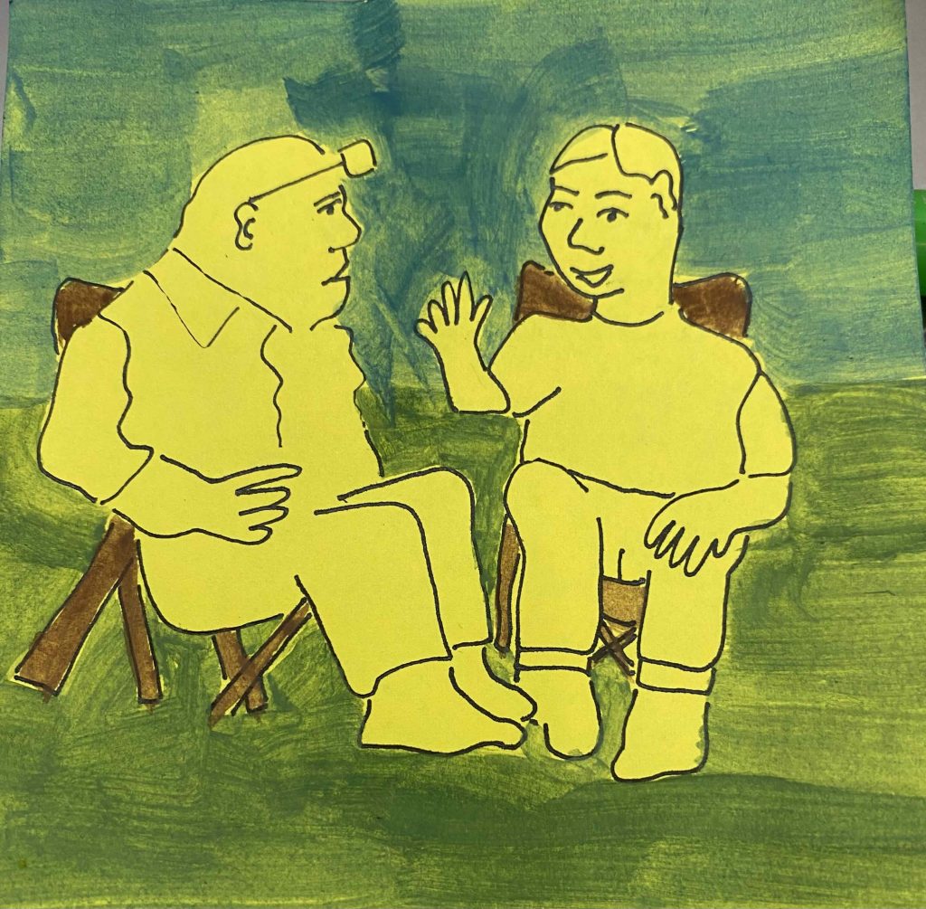
Yellow, orange and red are warm colors. They also compliment and can be used together, to create a harmonious look.
How do you develop a liking for these colors? First, you can pick a color to focus on. Then, you slowly move on to its partnering complimentary colors. When you finish with this group nof three, you should test out how much you like or tolerate these warm colors. Draw a picture and color it using these warm colors. If you have money to buy clothes or accessories, choose according to these colors which you have meditated on. Test your liking for them.
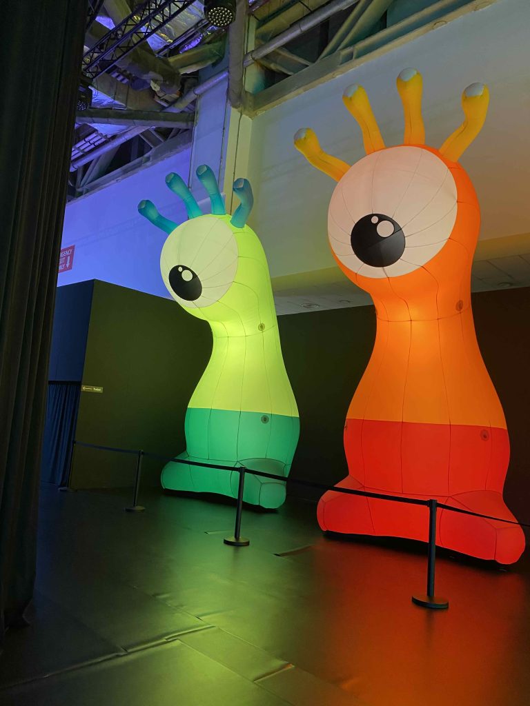
The maker of these large balloon sculptures used the warm color theory and the cool color theory. Red and orange compliment. On the opposite scale, the cool colors are green, blue and purple. The balloon sculture on the left used lime green and green.
If you’ve meditated on green color, try looking and meditating on different shades of green. Then look at photos of green objects. Do you like the different shades of green?